The 2025 Guide to Neutral Wedding Colors: Beyond Basic Beige
Explore the sophisticated world of neutral wedding colors. Learn how to layer textures, incorporate 2025 trends, and create a timeless, multi-dimensional palette.
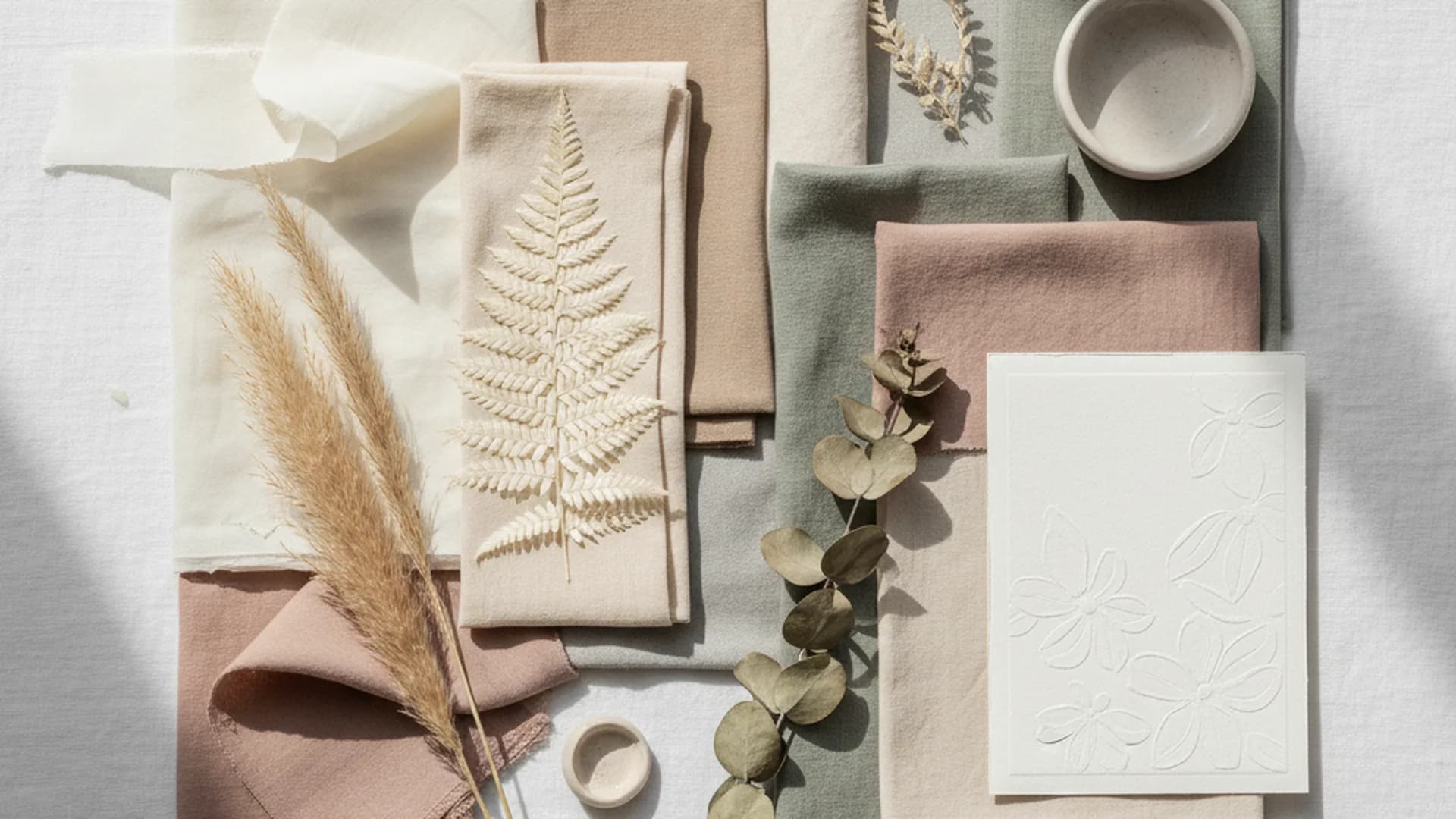
- Neutrals are a top choice for modern couples, led by Gen Z trends.
- Success in a neutral palette relies on texture and lighting rather than bold color.
- The "Rule of Three (Plus One)" ensures a cohesive and sophisticated design.
Neutral wedding colors are often unfairly branded as the "safe" or "boring" option by those who haven't seen a well-executed palette. As a Creative Director who has spent more time staring at ivory swatches than I have at my own reflection, let me tell you: neutrals are the secret weapon of sophisticated design. They aren't about an absence of color; they are about an abundance of atmosphere.
In 2025 and 2026, we are seeing a massive evolution. We’ve moved past the era of stark "all-white" hospitals—err, I mean weddings—and into a world of "elevated neutrals." This involves layering sand, mushroom, and espresso with unexpected metallic undertones to create a space that feels both organic and high-fashion.
Why Neutral Wedding Colors Dominate the Industry
It is no coincidence that neutral tones remain the cornerstone of bridal design. A large share of couples incorporate white into their palette. But it isn't just about tradition.
The Gen Z Influence
Interestingly, Gen Z couples are embracing neutrals even more fervently than Millennials, increasingly choosing white as their primary base. This shift is driven by a desire for "quiet luxury" and a focus on organic, sustainable-looking aesthetics. By using a base of Champagne Wedding Colors, couples can create a look that feels expensive without being ostentatious.
Versatility Across Seasons
One of the greatest misconceptions is that neutrals are strictly for spring. In reality, they are the chameleons of the wedding world. A palette of "Icy White" and "Silver" is a winter masterpiece, while "Burnt Sienna" and "Mocha" are the definition of autumnal warmth. Because neutrals don't compete with the environment, they allow the season's natural beauty to take center stage.
Tip
The "Rule of Three (Plus One)"
When you remove the distraction of bright pigments, the structure of your palette becomes incredibly important. To avoid a "flat" look that disappears in photographs, I always recommend the Rule of Three (Plus One).
- The Base (Primary): This is your most dominant shade (e.g., Ivory or Sand). It should cover about 60% of your wedding, from linens to large-scale floral installations.
- The Secondary (Support): A shade slightly darker or lighter than your base (e.g., Taupe or Dove Gray). This provides the first layer of depth.
- The Lowlight (Depth): A deep neutral (e.g., Espresso, Slate, or Mushroom). This grounds the space and prevents it from looking like a cloud.
- The Metallic (The Plus One): One metallic accent (Gold, Bronze, or Copper) to add a touch of light and luxury.
Do this
Upcoming Trends for 2025 and 2026
If you want to stay ahead of the curve, you need to look at how neutrals are being paired with "pseudo-neutrals"—colors found in nature that act as grounding elements.
Otherworldly Neutrals
A predicted 2025 breakout trend involves pairing deep Mocha Brown with a sharp, vibrant accent like Chartreuse or "Electric Lime." This "Otherworldly" approach takes organic tones and gives them a high-contrast, modern edge. It’s perfect for the couple that wants a neutral base but isn't afraid to make a statement.
The "Black Accent" Era
Minimalist brides are moving away from the "soft and fuzzy" look in favor of high-contrast sophistication. We are seeing layers of ivory and sand paired with bold black typography and hardware. Think sleek black candle holders on a cream linen cloth or black-bordered invitations. This look is heavily influenced by the Black and White Wedding Colors tradition but with a softer, sandier middle ground.
Sunset Neutrals for 2026
Looking further ahead to 2026, the trend is shifting toward "Sunset Neutrals." This palette draws from the 2024 legacy of "Peach Fuzz" but matures it with "Terracotta," "Blush," and "Burnt Sienna." It’s an organic, warm-toned vibe that feels like a Tuscan golden hour. This is often paired with Dusty Rose Wedding Colors to add a romantic, floral touch.
| Palette Name | Core Shades | Best For |
|---|---|---|
| Chateau Classic | Ivory, Cream, Sage | Historic Estates |
| High-Fashion Minimal | Sand, Parchment, Black | Urban Lofts |
| Organic Earth | Mocha, Terracotta, Copper | Outdoor/Barns |
| Coastal Cool | Dove Gray, Seafoam, White | Beachfront |
Why Texture is the New Color
In a neutral wedding, color is no longer the star of the show—texture is. When you strip away the "distraction" of bold hues, the eye looks for tactile variety to stay interested.
Note
To create an "elevated" neutral look, you must mix and match materials:
- Linens: Swap standard cotton for heavy linen or velvet runners.
- Stationery: Use handmade deckle-edge paper with letterpress printing.
- Florals: Mix dried elements (like bleached ruscus or pampas) with fresh white roses and orchids.
- Furniture: Use raw wood cross-back chairs against sleek, white-washed floors.
Heads up
From the OurVows workspace
Planning a wedding is a lot. We make it feel like less.
Checklist, budget, guest list, and a wedding website — together in one free workspace built for both of you.
Common Mistakes to Avoid
Even the most seasoned planners can trip up when working with a "simple" palette. Here are the most frequent blunders I see in the field:
1. The "Flat" Palette
This happens when a couple chooses only one or two shades of the same tone. Without varying the shades (light to dark), the decor disappears into the background of your photos. You need those "lowlights" like charcoal or espresso to define the edges of your design.
2. Ignoring the Venue’s "Non-Neutrals"
This is a heartbreaking mistake. You pick a gorgeous "Soft Sand" theme only to realize your venue has bright red carpets, blue velvet curtains, or orange-toned wood paneling that clashes horribly. Always pick your neutrals after you’ve secured your venue.
3. Matching Everything Perfectly
Expert planners warn against trying to match the bridesmaid dresses exactly to the napkins. Aim for "coordinating" tones rather than "identical" ones. If every single item is the exact same shade of "Champagne," the wedding looks commercial and stiff rather than organic and curated.
4. Thinking Neutrals are Cheaper
Many couples believe a white wedding will save them money because "white linens are standard." While basic white is cheap, creating a sophisticated neutral look often requires premium rentals like velvet, specialty wood, and silk. These "luxury neutrals" can actually be more expensive than standard colorful decor. If you're worried about costs, use a (Marketing) - Tools - Wedding Budget Calculator to see where your decor spend is going.
Lighting: The Make-or-Break Factor
Neutral palettes are highly sensitive to the color of light. Because these shades (especially creams and beiges) have subtle undertones, the wrong light bulb can ruin the entire effect.
- Avoid: "Cool White" or "Daylight" bulbs. These will turn your warm cream decor into a sickly, muddy yellow or a cold, sterile blue.
- Choose: "Warm White" bulbs or soft amber tones.
- The Candlelight Effect: Neutrals absolutely glow under candlelight. If your venue allows it, use varying heights of taper and pillar candles to make your ivory and gold tones come alive.
Tip
Frequently asked questions
Are neutral wedding colors boring?
Can I mix neutral colors with bold accents?
What is the most 'timeless' neutral palette?
How do I choose neutrals for my bridal party without washing them out?
Do neutral weddings work in the fall?
Conclusion
Choosing a neutral wedding palette is an exercise in restraint and texture. It allows the emotions of the day and the beauty of the venue to take center stage, providing a timeless backdrop that you won't regret looking at twenty years from now. Whether you are leaning into the "Black Accent" era or the warm "Sunset Neutrals" of 2026, remember that the magic lies in the layers.
Do this
Ready when you are
Ready to Design Your Palette?
Start planning your dream wedding today with our professional tools.
Ready when you are
Plan your wedding without the chaos.
Free forever for couples just getting started. Two minutes to set up. No credit card.
Keep reading
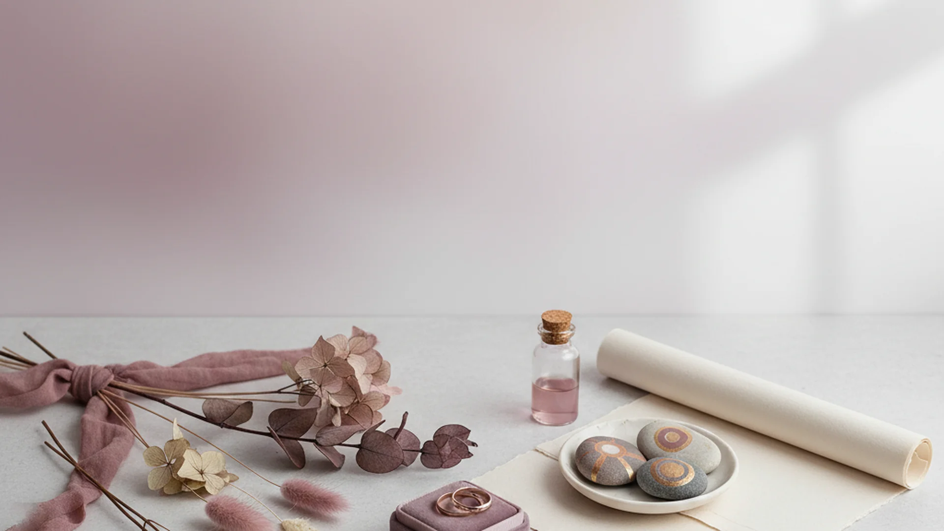
Mauve Wedding Colors: The Ultimate Guide for 2025–2026 Couples
Explore mauve wedding colors for 2025-2026. Learn about the 'Mocha Mousse' trend, floral selections, and how to style this sophisticated shade for any season.
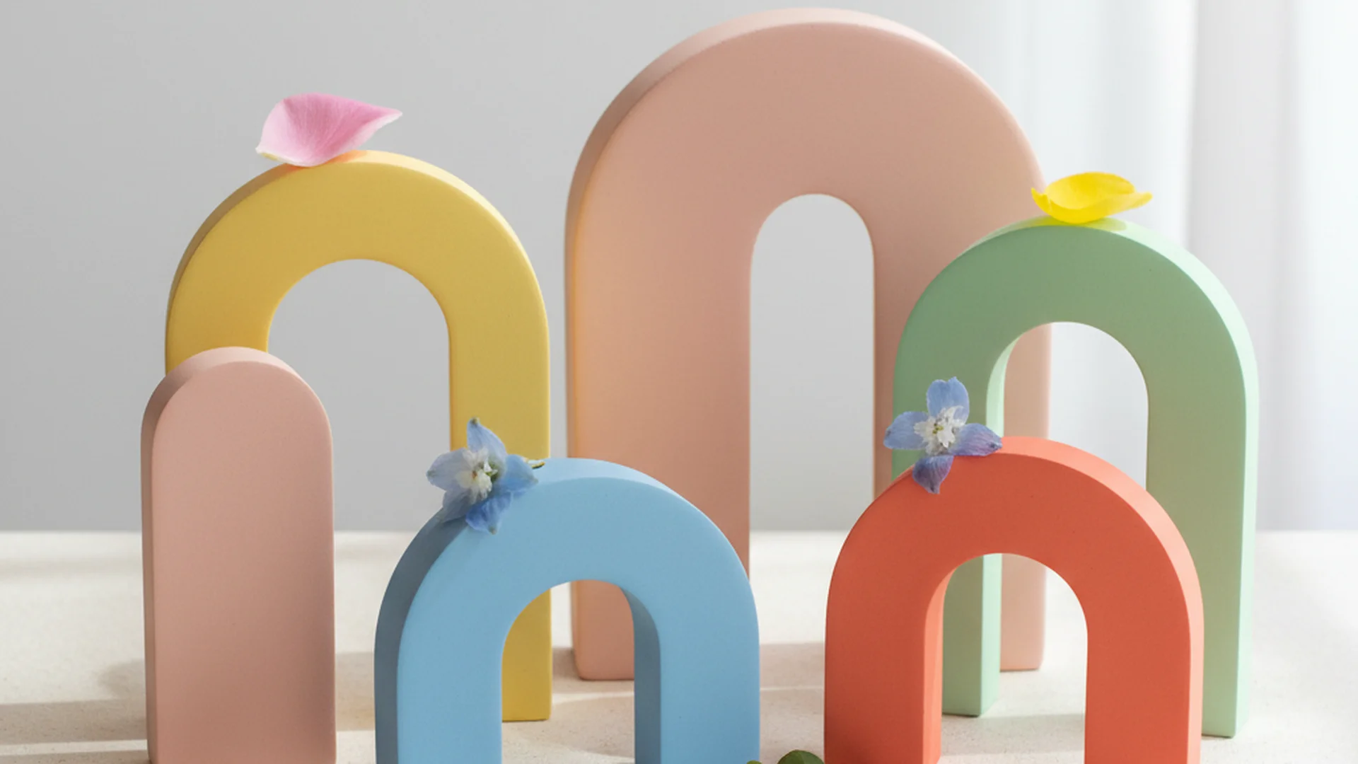
The Ultimate Guide to Bright Wedding Colors for 2025 and 2026
Discover the most vibrant bright wedding colors for 2025-2026. From "juicy" reds to cobalt blue, learn how to design a high-energy, modern wedding palette.
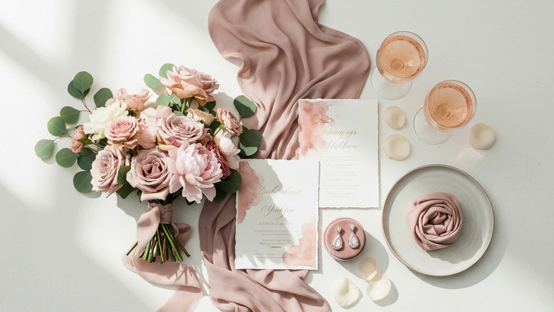
Dusty Rose Wedding Colors: The Ultimate Guide to the New Neutral
Discover why Dusty Rose wedding colors are the perfect "new neutral" for 2025-2026. Explore seasonal pairings, floral choices, and expert design tips.