Champagne Wedding Colors: The Ultimate Guide to the New Neutral
Discover why champagne wedding colors are the top trend for 2025-2026. Learn how to style this 'quiet luxury' palette with expert tips on lighting, textures, and more.
- Champagne is the leading 'quiet luxury' neutral for the 2025–2026 wedding seasons.
- To distinguish champagne from beige, focus on lustrous textures like satin and silk.
- Lighting is critical; warm-toned lighting prevents champagne fabrics from looking 'washed out.'
For years, the wedding industry was dominated by stark whites, cool-toned ivories, and the meteoric rise of rose gold. However, as we look toward the 2025 and 2026 seasons, a new aesthetic has claimed the throne: champagne wedding colors. This sophisticated shade is the cornerstone of the "quiet luxury" movement, offering a warmth and depth that pure white simply cannot achieve.
Choosing your wedding palette is about more than just matching linens; it is about setting the emotional tone for your celebration. As a relationship counselor, I often see how the environment of a wedding influences the mood of the couple and their guests. Champagne, with its shimmering, celebratory essence, creates an atmosphere of timeless elegance and inclusive warmth. Whether you are planning a grand ballroom affair or a minimalist coastal ceremony, champagne serves as the ultimate "neutral powerhouse."
Why Champagne is the "New Neutral"
In the world of color psychology, champagne is far more than just a light tan. It is a color associated with celebration, luxury, and success. Unlike ivory—which often carries heavy yellow undertones—or beige—which can feel flat and earthy—champagne has a light-reflective quality that mimics the effervescence of its namesake beverage.
This shift is easy to see in practice. A growing number of couples are moving away from traditional palettes in favor of champagne and ivory bases, and the trend shows no sign of slowing—more and more weddings now use a neutral base to anchor their design.
The Glow Factor
What sets champagne apart is its ability to "glow." Because the color sits perfectly between warm gold and cool silver, it catches the light beautifully. This makes it a safer, more universally flattering choice for bridesmaid attire than stark white, which can sometimes appear harsh in high-noon sunlight or under flash photography.
Tip
Designing with the 60-30-10 Rule
To create a professional-grade wedding design, I recommend following the 60-30-10 rule. This ensures that your champagne palette feels intentional rather than accidental.
- 60% Primary Color (Champagne): Use this for your largest visual areas. This includes table linens, floor-to-ceiling drapes, and the primary base of your floral arrangements.
- 30% Secondary Color: This provides the "personality" of the wedding. Think Dusty Rose Wedding Colors for a romantic feel or Navy Blue Wedding Colors for a classic, high-contrast look.
- 10% Accent Color: This is your metallic or bold "pop." For 2026, we are seeing a move toward "Quiet Gold"—a brushed, matte finish that adds luxury without the glare of traditional yellow gold.
Do this
5 Trending Champagne Wedding Palettes
Choosing a secondary color is where you can truly make the champagne theme your own. Here are five expert-curated palettes for the upcoming seasons:
| Style | Primary | Secondary | Accent |
|---|---|---|---|
| Old Money Luxury | Champagne | Black | Antique Gold |
| Boho Desert | Champagne | Terracotta | Dried Sage |
| Coastal Chic | Champagne | Seafoam Blue | Mother of Pearl |
| Winter Regal | Champagne | Emerald Green | Silver |
| Soft Romantic | Champagne | Dusty Rose | Mocha |
Real-World Example: The "Emerald & Bubbly" Duo
In 2025, winter weddings are trading traditional reds for a combination of Emerald Green Wedding Colors and champagne. The champagne prevents the dark green from feeling too heavy or "Christmas-themed," keeping the aesthetic firmly in the realm of high-end luxury.
Real-World Example: Mocha Mousse
The "Latte" wedding trend is here to stay. By pairing champagne with rich chocolatey browns and taupes, couples are creating a monochromatic look that feels grounded and organic. This works exceptionally well with sustainable fabrics like organic linen.
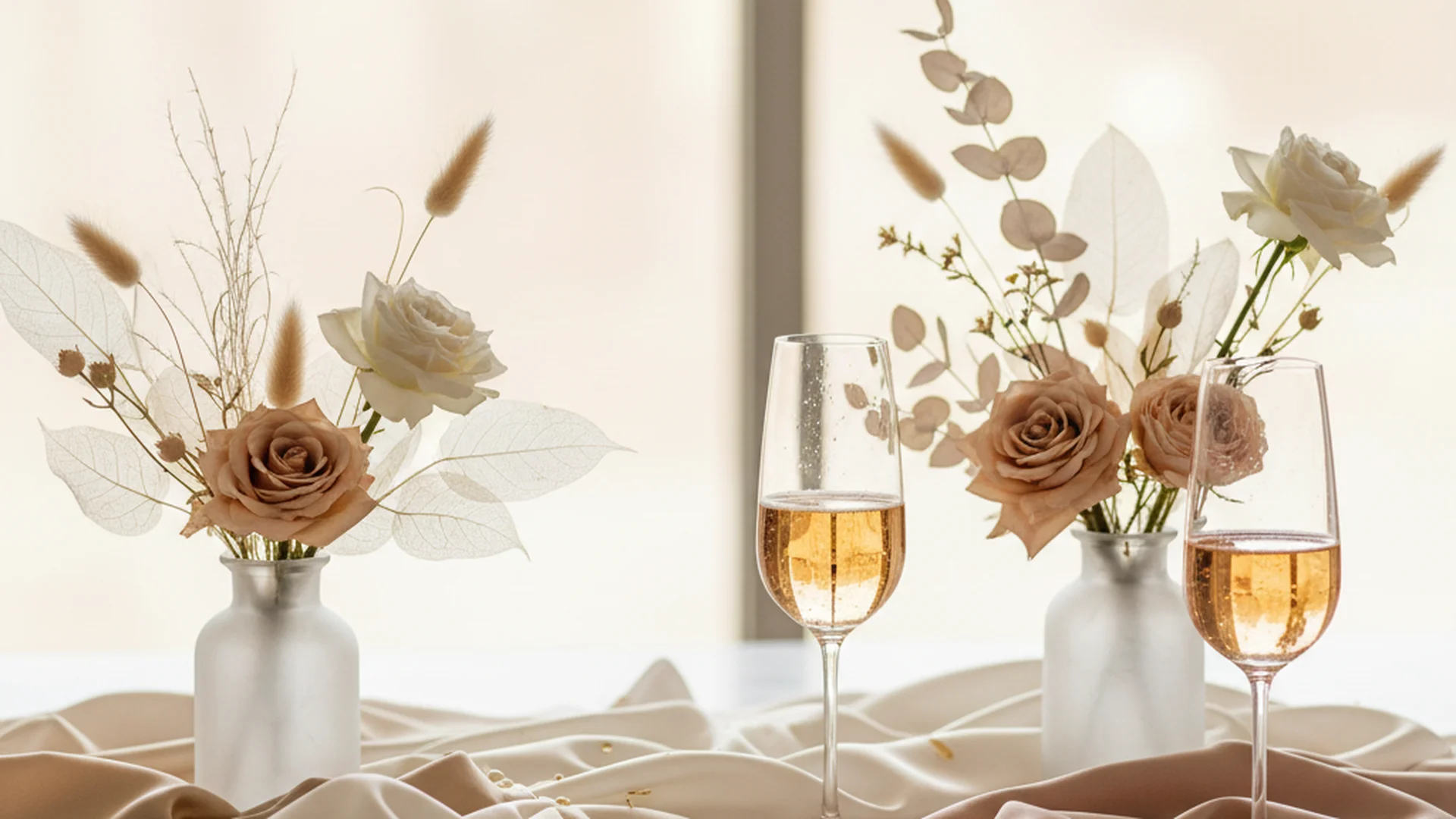
The Importance of Texture and Lighting
Because champagne is a subtle shade, it requires texture to prevent it from looking "flat" or "dirty" in photographs. A common mistake is using only one type of fabric throughout the venue.
Heads up
Layering Textures
To bring champagne to life, mix and match your materials. For example:
- Satin bridesmaid dresses that catch the light.
- Velvet table runners for a tactile, luxury feel.
- Lace or letterpress stationery with subtle gold foiling.
- Organic Linen napkins for a touch of rustic sophistication.
Note
From the OurVows workspace
Planning a wedding is a lot. We make it feel like less.
Checklist, budget, guest list, and a wedding website — together in one free workspace built for both of you.
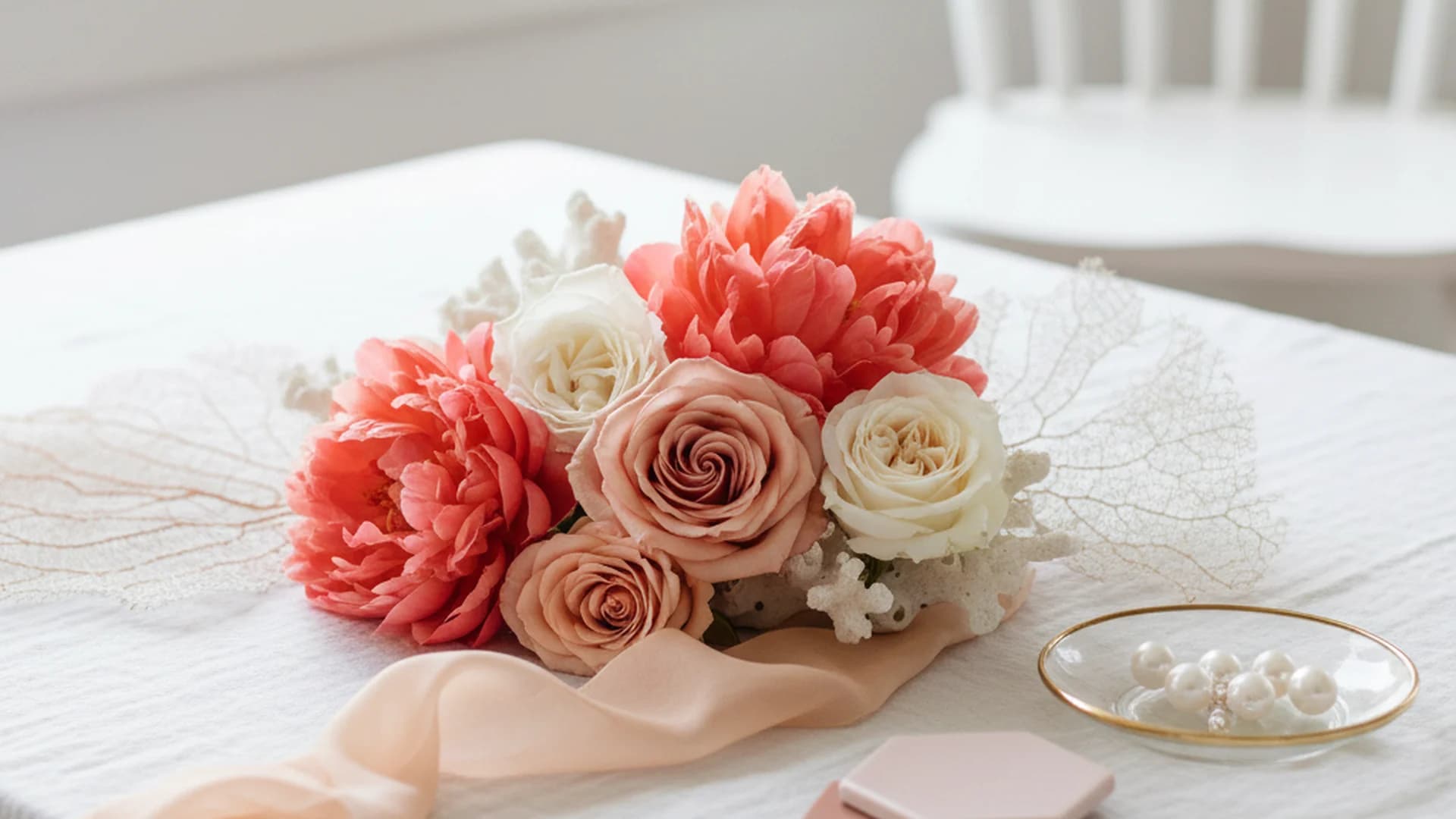
Champagne Wedding Florals
One of the unique challenges of a champagne wedding is the floral design. True "champagne" flowers are actually quite rare in nature. To achieve this look, florists often rely on specific rose varieties:
- Quicksand Roses: Known for their sandy, champagne-nude hue.
- Sahara Roses: A slightly warmer, golden-champagne tone.
- Bleached Elements: To get that airy, light-reflective look, many couples incorporate bleached ruscus, dried pampas grass, or preserved ferns.
If you are working with a tight budget, consider using the Wedding Budget Calculator to see how much of your floral budget can be allocated to these premium rose varieties.
Common Mistakes to Avoid
Even with a color as versatile as champagne, there are pitfalls that can dampen the aesthetic.
1. The "Beige Trap"
Many couples purchase "champagne" decor in matte materials (like basic paper or flat cotton). Without a metallic or lustrous finish, these items often look like a "dirty" beige. Always check your swatches under different lighting.
2. Ignoring Venue Colors
Champagne is a subtle, light-reflective shade. If your venue has bold, high-contrast features—such as bright red patterned carpets or dark mahogany wood walls—a pure champagne palette will be swallowed up. In these cases, you must add a high-contrast secondary color, like Black and White Wedding Colors, to ensure the decor stands out.
3. "The Uniform Look"
Do not try to match every single item to the exact same champagne swatch. In nature and high-end design, a monochromatic look is achieved by using 3–4 different shades of the same color. This creates depth and makes the space feel curated rather than manufactured.
4. Photography Contrast
If the bride is wearing ivory and the bridesmaids are wearing champagne, they can sometimes blend together in bright, outdoor sunlight. Ensure there is a slight tonal difference or a difference in texture (e.g., a lace bridal gown vs. satin bridesmaid dresses) to help the bridal party stand out in photos.
Frequently asked questions
Is champagne a primary color or an accent?
Does champagne suit all skin tones?
Is champagne the same as 'nude' or 'beige'?
Can I use champagne for a summer wedding?
Integration: The Signature Champagne Tower
To truly embrace the theme, I highly recommend a champagne tower. This serves as both a decor piece and a thematic reinforcement. It is a moment of "quiet luxury" that guests always remember. If you are in the middle of your planning, don't forget to check your 1 Month Before Wedding Checklist to ensure your glassware rentals are finalized for this feature.
Conclusion
Champagne wedding colors represent a shift toward intentional, timeless elegance. By moving away from the starkness of the past and embracing the "glow" of this new neutral, you create a wedding environment that feels both celebratory and serene. Remember to layer your textures, mind your lighting, and don't be afraid to mix shades to create a look that is uniquely yours.
Do this
Ready when you are
Start Planning Your Palette
Use our professional tools to organize your wedding colors and budget today.
Ready when you are
Plan your wedding without the chaos.
Free forever for couples just getting started. Two minutes to set up. No credit card.
Keep reading

The Ultimate Guide to Bright Wedding Colors for 2025 and 2026
Discover the most vibrant bright wedding colors for 2025-2026. From "juicy" reds to cobalt blue, learn how to design a high-energy, modern wedding palette.

Dusty Rose Wedding Colors: The Ultimate Guide to the New Neutral
Discover why Dusty Rose wedding colors are the perfect "new neutral" for 2025-2026. Explore seasonal pairings, floral choices, and expert design tips.
The Modern Guide to Coral Wedding Colors: 2025 Trends and Palettes
Explore the resurgence of coral wedding colors for 2025–2026. Learn how to style this versatile hue with expert tips on florals, fashion, and sophisticated color pairings.