The Ultimate Guide to Bright Wedding Colors for 2025 and 2026
Discover the most vibrant bright wedding colors for 2025-2026. From "juicy" reds to cobalt blue, learn how to design a high-energy, modern wedding palette.

- Vibrant, high-energy hues are replacing neutrals for 2025 and 2026 weddings.
- The 60-30-10 rule is essential for balancing bold colors without overwhelming the space.
- Bright colors like Cobalt Blue and Cayenne Red are top choices for fashion-forward couples.
For years, the wedding industry was dominated by "safe" aesthetics—think muted eucalyptuses, soft champagnes, and the ubiquitous "millennial pink." But as we look toward the 2025 and 2026 seasons, a seismic shift is occurring. Couples are no longer afraid to be loud. Choosing bright wedding colors is more than just a design preference; it is a declaration of joy, personality, and a move toward maximalism that celebrates the high-energy nature of a union.
As an interfaith wedding officiant, I have seen firsthand how a vibrant palette can transform the atmosphere of a ceremony. When the aisle is lined with "Electric Pastels" or "Juicy Reds," the guests feel the energy before the first word is even spoken. In this guide, we will explore why bold is back and how you can master the art of the vibrant palette.
The Rise of the High-Energy Wedding Palette
The move toward bright wedding colors isn't happening in a vacuum. It reflects a post-minimalist world where couples want their wedding to feel like a one-of-a-kind event. For most couples, the color palette is one of the top design decisions they make. This is because color dictates the "mood" of the entire day—from the initial save-the-date to the final dance under neon lights.
While white remains a staple base for many weddings, there is a significant movement toward saturated hues. Green, in various shades from lime to emerald, has become one of the most popular non-white choices, with a growing number of couples incorporating it into their theme.
Tip
Trending Bright Wedding Colors for 2025 and 2026
If you are planning a wedding in the next two years, you are likely seeing a move away from soft peaches and toward what designers call "edible" or "juicy" colors. Here are the top trends currently defining the bright wedding landscape.
1. "Juicy" Reds and Oranges
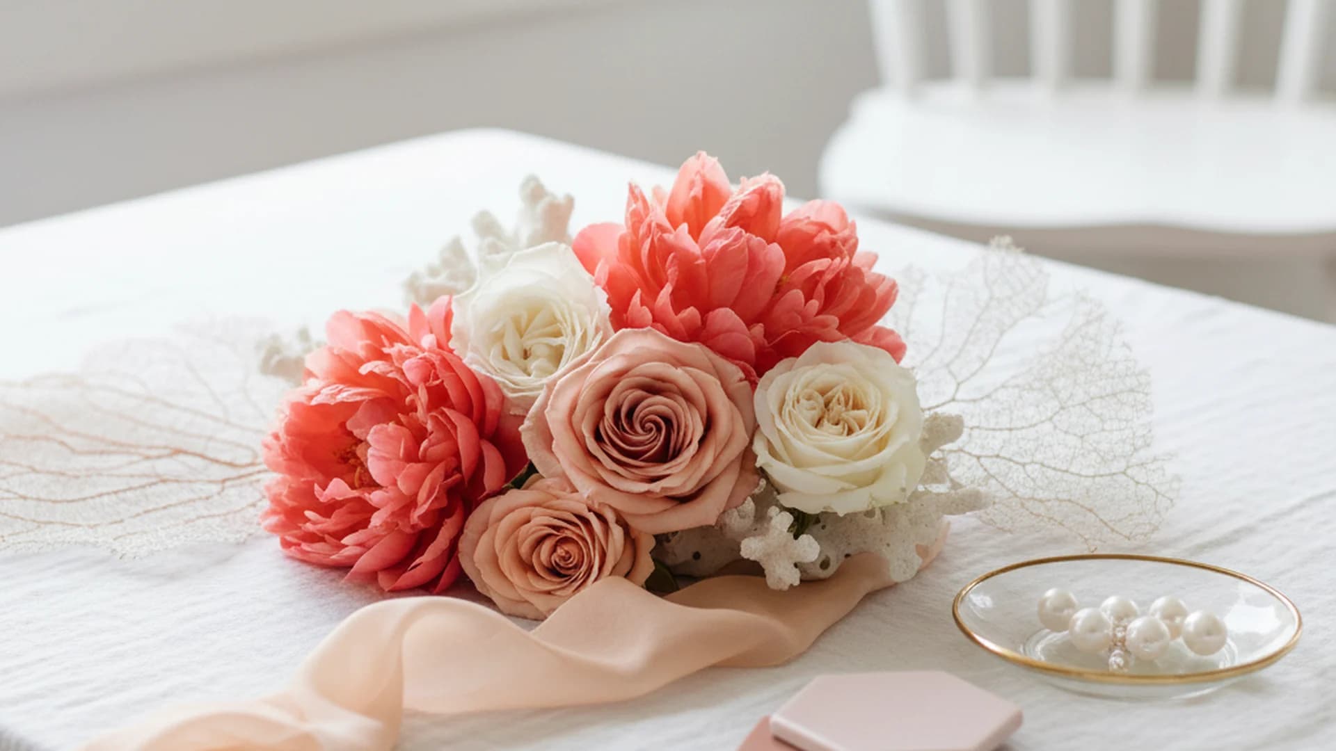
The 2025 season is seeing a massive surge in Cayenne Red, Papaya Orange, and Watermelon. These colors feel fresh, energetic, and optimistic. Unlike the deep burgundies of the past decade, these reds have yellow or pink undertones that make them pop against outdoor greenery. For a similar but slightly softer look, many couples are exploring Coral Wedding Colors to bridge the gap between bright and classic.
2. Cobalt Blue: The "Main Character" Blue
Navy is no longer the default. In 2026, Cobalt Blue (also known as Klein Blue) is emerging as a bold anchor color. It is a high-fashion hue that looks stunning when paired with stark white or a "Citrine Yellow." It provides a sophisticated but unmistakably bright foundation for suits, linens, and even floral installations.
3. Electric Pastels
This is the "Bridgerton" revival with a modern twist. Instead of soft lavenders and dusty roses, the trend is moving toward amping up the saturation to nearly neon levels. Think of a lavender that feels "lit from within" or a mint green that borders on neon. It’s a way to keep the romantic feel of pastels while ensuring the wedding looks contemporary and high-contrast.
4. Fresh Lime and Chartreuse
Once considered "clashing" colors, neon-adjacent greens are being used as "pops" in modern arrangements. Using orchids, anthuriums, and dyed tropical leaves, florists are creating zesty, modern edges that provide a refreshing break from traditional greenery. This trend pairs exceptionally well with Emerald Green Wedding Colors for a layered, monochromatic look.
Note
Mastering the Design: The 60-30-10 Rule
Using bright wedding colors requires a strategic approach. If you use too much of a highly saturated hue, you risk "exhausting" the eyes of your guests. To maintain a high-end feel, professional designers recommend the 60-30-10 Rule:
- 60% Primary Color: Use this for your dominant elements like linens, large-scale floral installations, or the venue's natural backdrop.
- 30% Secondary Color: This goes toward your bridesmaid dresses, table napkins, and ceremony programs.
- 10% Accent Color: Reserve your brightest, most "neon" or metallic hue for the small details—stationery accents, glassware, or the groom’s pocket square.
Example Palette 1: The Sunset Soiree
- 60%: Terracotta (Grounded base)
- 30%: Mustard Yellow (Secondary energy)
- 10%: Cayenne Red (Bright accent)
Example Palette 2: The Electric Garden
- 60%: Fresh Mint (Base)
- 30%: Cobalt Blue (Contrast)
- 10%: Neon Pink (The "pop")
Do this
Bright Colors Across the Seasons
A common misconception is that bright wedding colors are only for summer "tropical" themes. In reality, bold hues work year-round if you choose the right saturation.
| Season | Recommended Bright Hues | Pairing Suggestion |
|---|---|---|
| Spring | Electric Lavender, Lime | Pair with crisp white |
| Summer | Watermelon, Papaya | Pair with turquoise or gold |
| Autumn | Burnt Orange, Mustard | Pair with "Mocha Mousse" |
| Winter | Cobalt Blue, Fuchsia | Pair with silver or deep emerald |
In winter, we are seeing a trend toward "Jewel-Toned Bolds." Instead of a muted winter palette, couples are opting for Deep Emerald and Magenta Fusion. These colors provide a warm, inviting glow in indoor venues during the darker months.
Heads up
From the OurVows workspace
Planning a wedding is a lot. We make it feel like less.
Checklist, budget, guest list, and a wedding website — together in one free workspace built for both of you.
Cultural Significance of Bold Colors
As an interfaith officiant, I often work with couples who incorporate cultural traditions into their vibrant palettes. For example, in Chinese weddings, red is the dominant color because it symbolizes fertility, luck, and the warding off of negative energy. In many South Asian weddings, a kaleidoscope of bright colors is standard, symbolizing the vibrancy of life and the joining of two families.
When choosing your bright wedding colors, consider if there are cultural or family traditions you can honor. A "bright" palette can be a beautiful way to bridge the gap between modern trends and ancestral heritage.
Common Mistakes to Avoid
While bold colors are exciting, they come with unique challenges. Avoid these common pitfalls to ensure your wedding looks polished.
1. Ignoring the Venue’s "Permanent" Palette
If your venue has deep red carpets or gold-leafed walls, don't try to force a palette of "Electric Purple" and "Lime Green." It will fight the space. Instead, choose bright colors that complement the existing tones. If the venue is gold, lean into warm oranges or deep teals.
2. Over-Matching Flowers
Nature rarely produces "exact" color matches. If you try to force your florist to find a rose that matches a specific Pantone swatch of fuchsia, you may end up with artificial-looking, dyed flowers that wilt quickly. Instead, give your florist a "color family" and allow the natural variations to add texture and depth to your arrangements.
3. Skipping Neutrals
Even the boldest "maximalist" weddings need a resting place for the eyes. Neglecting to include a neutral (like ivory, beige, or soft grey) can make the decor feel "loud" and overwhelming. The neutral acts as a canvas that allows the bright colors to actually stand out rather than competing for attention.
4. Forgetting the Lighting
A vibrant orange that looks stunning in the afternoon sun can look "muddy" or brown under yellow indoor incandescent bulbs. If you are planning a late-night reception, ask your lighting designer to use "cool" or "neutral" gels to keep your colors looking crisp.
Tip
Frequently asked questions
Can I mix bold colors with neutrals?
Do bright colors work in winter?
How many colors should be in my palette?
Will bright colors look bad in photos?
Is "Bright" the same as "Neon"?
Conclusion: Embodying Your Joy
Your wedding color palette is the visual soundtrack of your celebration. By choosing bright wedding colors, you are inviting your guests into a space filled with energy, warmth, and modern flair. Whether you opt for the "juicy" reds of a summer sunset or the high-fashion punch of Cobalt Blue, remember that the most successful palettes are those that reflect your unique story as a couple.
Ready to start planning the rest of your vibrant celebration? Use our tools to stay on track and ensure every detail is as colorful as your vision.
Do this
Ready when you are
Plan Your Dream Wedding
Start organizing your vibrant celebration with our expert tools.
Ready when you are
Plan your wedding without the chaos.
Free forever for couples just getting started. Two minutes to set up. No credit card.
Keep reading

Dusty Rose Wedding Colors: The Ultimate Guide to the New Neutral
Discover why Dusty Rose wedding colors are the perfect "new neutral" for 2025-2026. Explore seasonal pairings, floral choices, and expert design tips.
The Modern Guide to Coral Wedding Colors: 2025 Trends and Palettes
Explore the resurgence of coral wedding colors for 2025–2026. Learn how to style this versatile hue with expert tips on florals, fashion, and sophisticated color pairings.
Champagne Wedding Colors: The Ultimate Guide to the New Neutral
Discover why champagne wedding colors are the top trend for 2025-2026. Learn how to style this 'quiet luxury' palette with expert tips on lighting, textures, and more.