The Sophisticated Guide to Muted Wedding Colors: Timeless Elegance for 2025-2026
Discover the art of muted wedding colors. Learn how to use desaturated tones, dusty hues, and earthy palettes to create a sophisticated, timeless aesthetic.
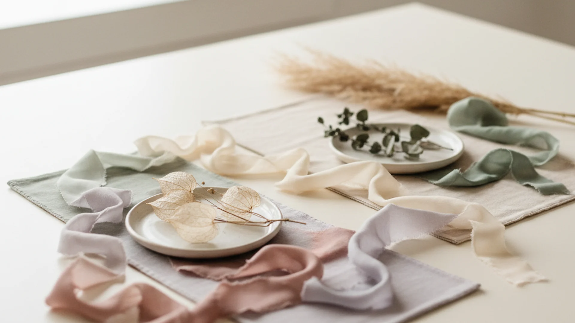
- Muted colors are "tones" (color + gray) rather than "tints" (color + white).
- The "Old Money" and "Regency Core" aesthetics drive the trend toward desaturated palettes.
- Success depends on the 60-30-10 rule and layering diverse textures.
There was a time in wedding history—let’s call it the "Neon Era"—where if your bridesmaids didn’t glow in the dark, you weren’t trying hard enough. But as we move into a new era of matrimonial design, couples are trading high-saturation "rainbow" palettes for something far more nuanced. Muted wedding colors are the sophisticated answer to the sensory overload of the past decade. They offer a "low-arousal" environment that doesn't scream for attention but rather whispers of elegance, nostalgia, and understated luxury.
As a Creative Director, I often tell my clients that a muted palette is like a well-tailored suit: it doesn’t need a flashing neon sign to tell people it’s expensive and tasteful. Whether you are leaning into the "Old Money" aesthetic or a "Fine-Art" romantic vibe, mastering the art of desaturation is your ticket to a gallery-worthy wedding.
What Exactly Are Muted Wedding Colors?
To understand muted colors, we have to go back to basic art school theory. Many people confuse "muted" with "pastel," but they are fundamentally different. Pastels are tints, created by adding white to a base color. This results in bright, airy hues like baby pink or mint green.
Muted colors, on the other hand, are tones or shades. They are created by adding gray or a complementary hue to a base color, effectively "killing" the brightness. This results in what we call "dusty," "earthy," or "muddy" tones. Think of a vibrant navy blue that has been left in the sun for twenty years—that soft, lived-in, desaturated blue is exactly what we’re looking for.
The Psychology of Desaturation
Why are we suddenly obsessed with colors that look like they’ve been through a vintage photo filter? In color psychology, muted tones are proven to evoke feelings of calmness and serenity. In a world that is increasingly loud and digital, a muted wedding provides a visual sanctuary for your guests. It encourages relaxation and conversation rather than the high-energy "party vibe" that neon or primary colors demand.
Note
The 60-30-10 Rule for Muted Palettes
One of the biggest fears couples have is that a muted palette will look "washed out" or flat. This usually happens because the couple didn't provide enough contrast. To avoid a "beige-on-beige" disaster, we recommend the 60-30-10 rule.
- 60% Primary Muted Tone: This is your foundation. Use it for your largest visual areas, such as bridesmaid dresses, table linens, and the primary wash of your invitations.
- 30% Secondary Hue: This provides the "story." This color should be used in your florals, stationery accents, and perhaps the groom’s accessories.
- 10% Anchor Color: This is the secret sauce. You need a deeper, darker "anchor" to provide tonal depth for the camera. This could be charcoal, espresso, navy, or even a deep forest green. Use this for candles, cutlery, or typography.
Tip
Seasonal Versatility: Beyond the Winter Wedding
A common misconception is that muted colors are reserved for the gloomy days of fall and winter. While a Burgundy Wedding Colors palette or Emerald Green Wedding Colors works beautifully in the colder months, muted tones are evolving for year-round use.
Spring and Summer: Sun-Washed Hues
For 2025, we are seeing a massive shift toward "sun-washed" muted tones. Imagine a garden that has been slightly bleached by the August sun.
- Butter Yellow: Not a bright sunshine yellow, but a creamy, desaturated "vanilla bean" tone.
- Sage Green: A staple of the Dusty Blue Wedding Colors family that brings an organic, earthy feel to outdoor ceremonies.
- Muted Peach: Replacing the vibrant corals of yesteryear with a soft, clay-like warmth.
Fall and Winter: The Moody Muted
This is where the "Fine-Art" aesthetic shines. Think of an oil painting with deep, "jammy" plums, antiqued greens, and charcoal accents. These colors feel heavy, warm, and incredibly romantic when paired with candlelight.
| Season | Primary Muted Tone | Recommended Anchor |
|---|---|---|
| Spring | Pale "Washed" Blue | Charcoal Gray |
| Summer | Muted Peach/Clay | Espresso Wood |
| Fall | Dusty Mauve | Deep Plum |
| Winter | Slate Gray | Black/Onyx |
Expert Recommendations for Florals and Decor
When you move away from high-saturation colors, you have to lean more heavily on texture and foliage. This is where your creative direction really comes into play.
Focus on "Silver" Foliage
If you want to maintain a muted look, you cannot use bright, "true" green leaves. They will clash with your desaturated flowers. Instead, ask your florist for "silver" or "dusty" greens:
- Eucalyptus: The classic choice for a muted, dusty look.
- Olive Branches: Perfect for an "Old World" or Mediterranean vibe.
- Dusty Miller: Its velvet-like texture and silver-white color are the epitome of the muted aesthetic.
Layering Textures
Because muted colors have less visual "punch," a palette with only one texture can look flat and cheap. To create depth, you must mix your materials. Pair a matte linen tablecloth with silk napkins and velvet chair cushions. The way light hits these different surfaces creates "visual shadows," which makes the colors feel richer even if they are desaturated.
Heads up
From the OurVows workspace
Planning a wedding is a lot. We make it feel like less.
Checklist, budget, guest list, and a wedding website — together in one free workspace built for both of you.
Emerging Trends for 2025-2026
As we look toward the next few wedding seasons, several specific muted trends are dominating the luxury market.
1. Pale Blue & Monochrome
Move over, Dusty Blue Wedding Colors. The new trend is a "washed-out" pale blue that is almost gray. It’s being paired with Black and White Wedding Colors for a look that feels incredibly modern and chic. This is the "Cool Girl" wedding palette of 2026.
2. Earthy Minimalist
This trend replaces the bright "Boho" oranges with clay, cream, and warm taupe. It’s part of the "Quiet Luxury" movement—focusing on high-quality materials rather than flashy colors. It feels grounded, organic, and incredibly sophisticated.
3. Fine-Art Impressionist
Inspired by the masters like Monet, this palette uses "muddy" versions of romantic colors. Think of an antiqued lavender, a bruised plum, and a "dirty" rose. It’s designed to look like a vintage painting come to life. If you are a fan of Dusty Rose Wedding Colors, this is the next evolution for your mood board.
Common Mistakes to Avoid
Even the most well-intentioned muted palette can go wrong if you aren't careful. Here are the three most common pitfalls I see as a Creative Director.
Mistake 1: Over-Matching
Couples often try to get the exact same shade of "Dusty Rose" across their plastic signage, chiffon bridesmaid dresses, and fresh roses. This is mathematically impossible and looks forced. Muted palettes work best when you use a range of similar tones. Embrace the variations—it looks more organic and expensive.
Mistake 2: Ignoring the Venue's "Temperature"
Muted colors are highly sensitive to their surroundings. A dusty blue may look like a beautiful sky tone in a white-walled gallery, but it might turn into a depressing "hospital gray" in a dark, wood-paneled ballroom.
Tip
Mistake 3: Lack of Tonal Depth
If every single item in your wedding is the same level of "medium-muted," your photos will look like a gray blur. You must have light points (cream/ivory) and dark points (your anchor color) to create a visual "staircase" for the eye to follow.
Frequently asked questions
Will muted colors look washed out in photos?
How do I describe "muted" to my vendors?
Are muted colors boring for a celebration?
Can I mix muted colors with metallics?
Conclusion: The Quiet Power of Desaturation
Choosing a muted wedding color palette is a bold move toward timelessness. It shows a level of confidence in your aesthetic that doesn't rely on trends or "loud" visual cues. By focusing on tones, textures, and the 60-30-10 rule, you create an environment that is not only beautiful today but will remain elegant in your wedding album for decades to come.
Remember, the goal of a muted palette is to create a backdrop for your love, not a distraction from it. When you strip away the neon and the high-saturation noise, what’s left is the sophisticated, serene essence of your celebration.
Do this
Ready when you are
Plan Your Palette
Start organizing your wedding colors and budget today with our professional suite of tools.
Ready when you are
Plan your wedding without the chaos.
Free forever for couples just getting started. Two minutes to set up. No credit card.
Keep reading
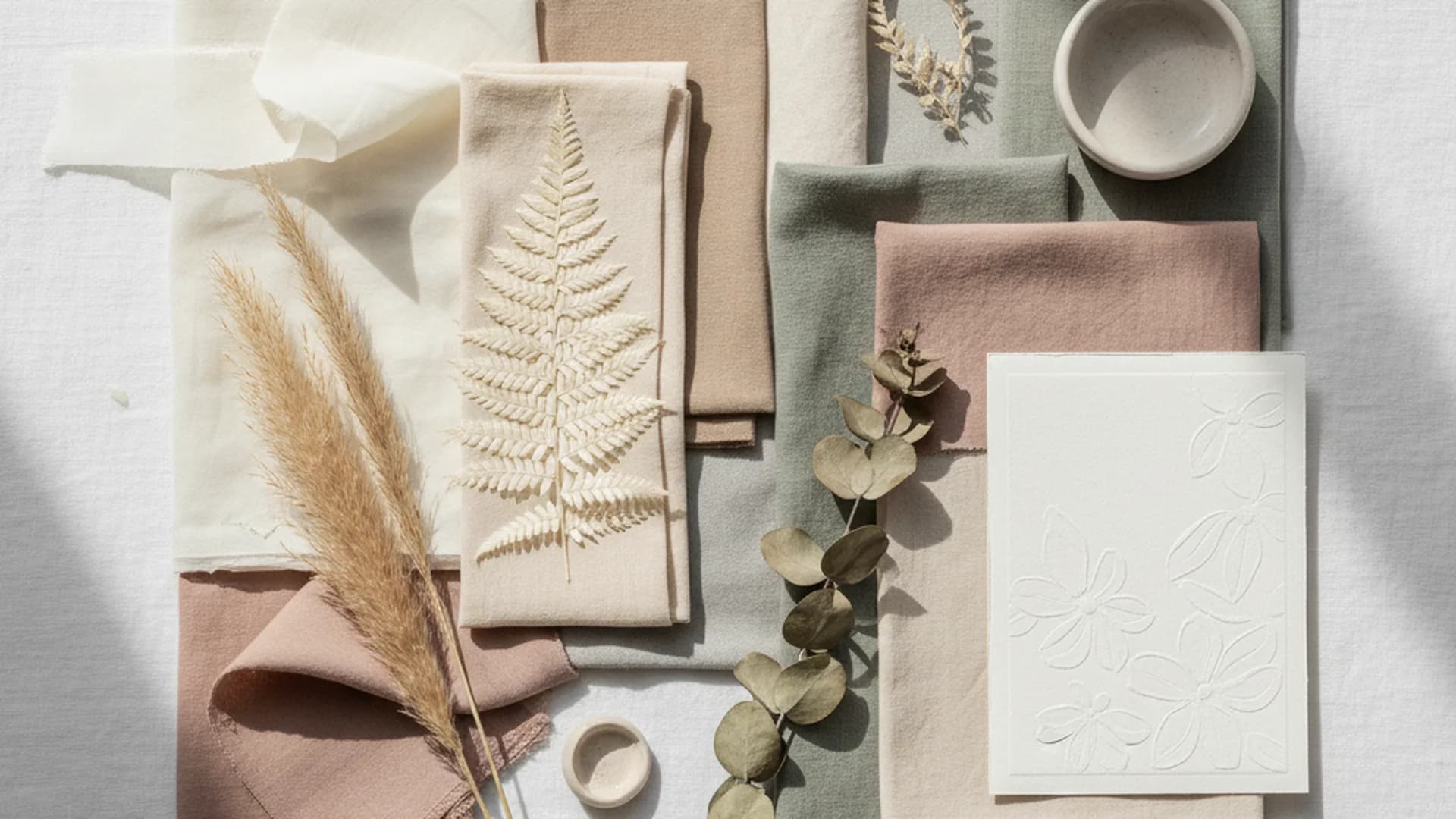
The 2025 Guide to Neutral Wedding Colors: Beyond Basic Beige
Explore the sophisticated world of neutral wedding colors. Learn how to layer textures, incorporate 2025 trends, and create a timeless, multi-dimensional palette.
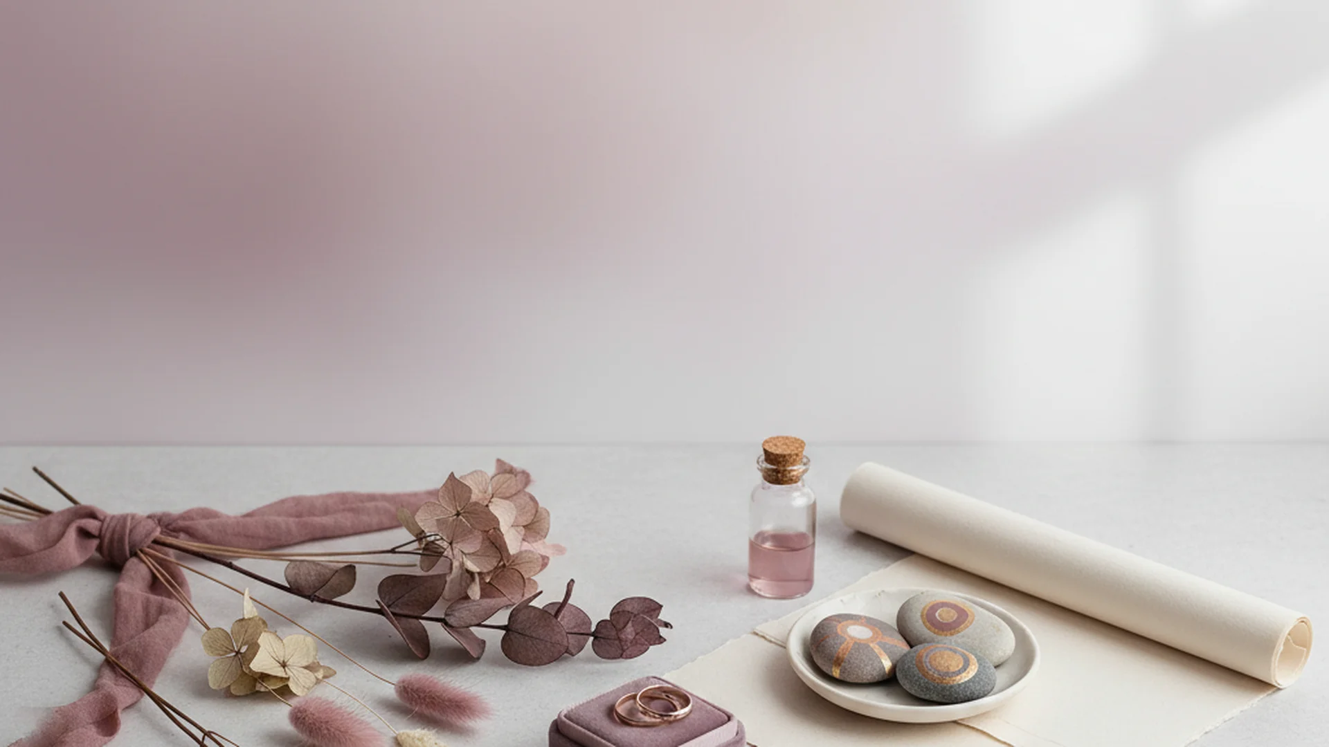
Mauve Wedding Colors: The Ultimate Guide for 2025–2026 Couples
Explore mauve wedding colors for 2025-2026. Learn about the 'Mocha Mousse' trend, floral selections, and how to style this sophisticated shade for any season.
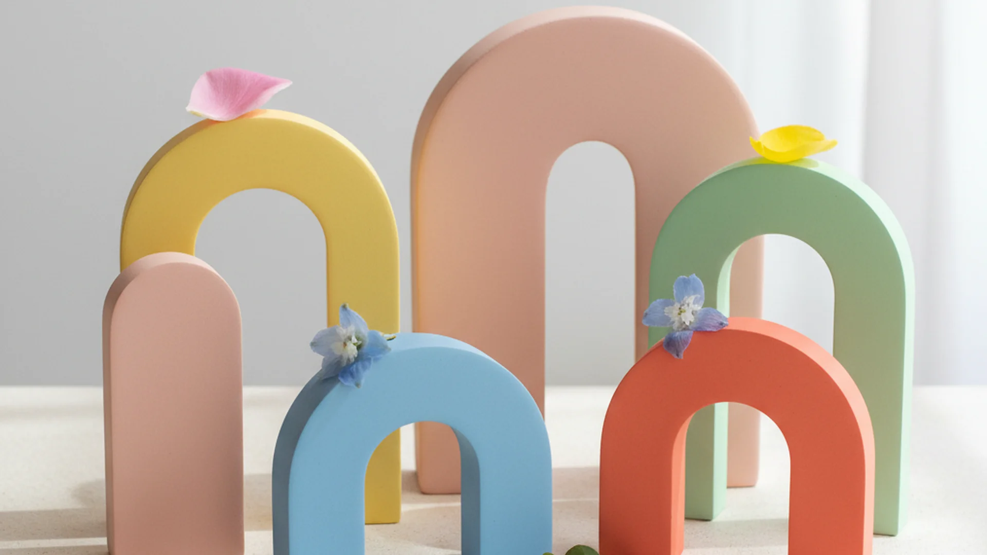
The Ultimate Guide to Bright Wedding Colors for 2025 and 2026
Discover the most vibrant bright wedding colors for 2025-2026. From "juicy" reds to cobalt blue, learn how to design a high-energy, modern wedding palette.