The Modern Guide to Coral Wedding Colors: 2025 Trends and Palettes
Explore the resurgence of coral wedding colors for 2025–2026. Learn how to style this versatile hue with expert tips on florals, fashion, and sophisticated color pairings.
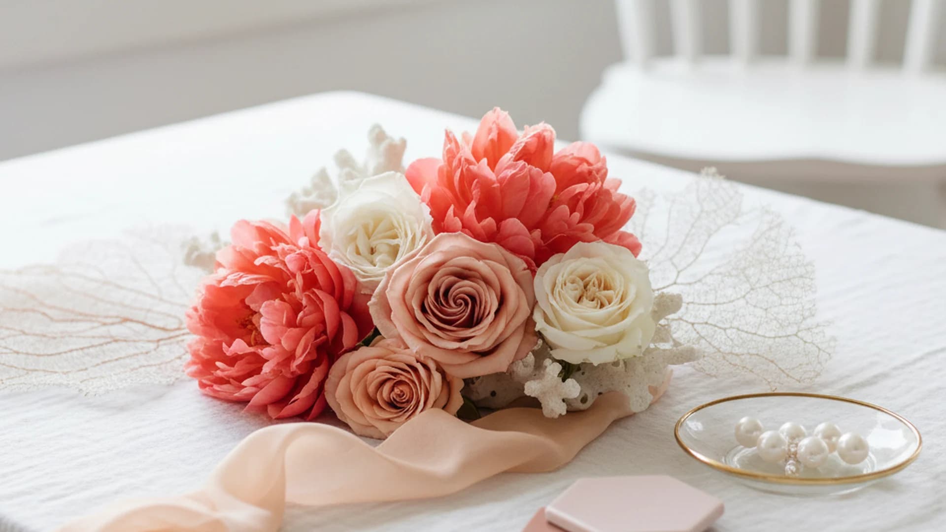
- Coral is evolving from a 'beachy' staple into a sophisticated, year-round palette.
- Follow the 60-30-10 rule to balance vibrant coral with neutrals and accents.
- Coral is universally flattering for bridesmaid skin tones due to its mix of warm and cool undertones.
For years, coral was the "destination wedding" default—the color you chose simply because you were getting married within earshot of a coconut falling from a tree. But as we move into the 2025 and 2026 seasons, coral wedding colors are undergoing a massive rebranding. We are stepping away from the neon-tropical cliché and moving toward a world of "Old-World" Italian vineyard aesthetics, "Citrus Brights," and sophisticated monochromatic gradients.
As a Creative Director who has seen enough "safe" pastels to last a lifetime, I can tell you that the return of coral is the breath of fresh air the industry needs. It is high-energy, mood-boosting, and—dare I say—actually interesting to look at. Nearly 30% of modern couples are now ditching the muted "sad beige" aesthetic in favor of these vibrant pops, signaling a shift toward "dopamine decor" that celebrates the joy of the occasion.
The Evolution of Coral: Beyond the Beach
The biggest misconception about coral is that it belongs exclusively on a sandy shore. In reality, coral is one of the most versatile shades in the designer’s toolkit because it sits perfectly on the fence between pink and orange. This unique position allows it to adapt to various themes, from a refined Black and White Wedding Colors foundation with a single "pop" to a full-blown maximalist garden party.
In 2025, we are seeing a shift toward "Burnt Coral" and "Coral-Terracotta." These deeper, earthier iterations allow the color to transition seamlessly into fall weddings, mimicking the hues of a late September sunset. When you pair these shades with textures like velvet or heavy linen, the "tropical" vibe vanishes, replaced by something far more editorial and "Fine Art."
Tip
The 60-30-10 Rule for a Balanced Palette
Achieving a professional look isn't about how much coral you use; it's about how you balance it. Designers use the 60-30-10 rule to ensure the eye has a place to rest.
- 60% Primary Color (The Foundation): This is usually your neutral. Think Ivory, Sand, Dove Grey, or even a deep Navy Blue Wedding Colors.
- 30% Secondary Color (The Star): This is where your coral wedding colors shine. Use this for bridesmaid dresses, table runners, and large floral installations.
- 10% Accent Color (The Spark): This provides the "jewelry" for your wedding. Popular choices include Gold Wedding Colors, Teal, or Sage Green.
Real-World Example: The "English Garden"
Imagine a garden setting where 60% of the visual space is Sage Green (foliage and linens), 30% is a mix of Peach and Coral (flowers and stationery), and 10% is Antique Gold (cutlery and frames). This combination feels timeless rather than trendy.
Floral Economics: Why Coral Wins the Budget Battle
Couples typically spend 8–10% of their total budget on flowers. You can check your specific numbers using our (Marketing) - Tools - Wedding Budget Calculator. When working with a color like coral, you actually get more "bang for your buck."
Why? Because some of the most famous "statement" flowers—the ones that take up the most physical space and create the most visual drama—grow naturally in stunning coral shades.
| Flower Variety | Season | Vibe |
|---|---|---|
| Coral Charm Peony | Late Spring | Luxurious, massive blooms that change color as they open. |
| Miss Piggy Rose | Year-round | A reliable bi-color rose with a warm glow. |
| Ranunculus | Spring/Winter | Intricate, paper-thin petals that look like art. |
| Dahlias | Late Summer/Fall | Bold, architectural, and available in deep "Burnt Coral." |
Note
Styling Your Bridal Party
One of the most frequent questions I get is: "Does coral look good on everyone?"
The answer is a resounding yes. Because coral contains both warm (orange) and cool (pink) undertones, it is one of the few colors that flatters almost every skin tone. However, the intensity of the shade matters. Darker skin tones look spectacular against vibrant "Living Coral" or "Neon Coral," while fairer skin tones often pop best against "Coral Blush" or "Apricot-leaning" shades.
The Gradient Trend
A top trend for the 2025–2026 seasons is the "mismatched" or "gradient" look. Instead of putting every bridesmaid in the exact same dress, have them choose shades ranging from soft peach to deep, vivid coral. This creates an organic, "sunset" effect in your photos that feels much more modern than a wall of identical fabric.
The Groom’s Look
What color suit should the groom wear with coral?
- Navy Blue: Provides the most striking, modern contrast. It makes the coral look like a "jewel tone."
- Light Grey or Tan: Perfect for summer or outdoor weddings, keeping the overall look airy and light.
- Charcoal Grey: Adds a layer of formality and "grounding" to the brightness of the coral.
Do this
From the OurVows workspace
Planning a wedding is a lot. We make it feel like less.
Checklist, budget, guest list, and a wedding website — together in one free workspace built for both of you.
2025–2026 Trend Forecast
If you want your wedding to feel ahead of the curve, consider these four emerging palettes that utilize coral wedding colors in innovative ways:
1. "Oceanic Elegance" (2026 Forecast)
This is the "New Coastal." Move away from navy and white. Instead, use Seafoam Green, Soft Aqua, and Coral Blush paired with metallic champagne. It’s airy, sophisticated, and feels like a luxury resort in the Mediterranean.
2. "Citrus Brights"
Part of the "dopamine decor" movement, this 2025 trend features Coral, Lemon Yellow, and Mandarin Orange. This is for the couple who wants their wedding to feel like a high-energy party. It works best in industrial loft spaces or bright outdoor venues.
3. "Old-World Coral"
Inspired by Italian villas, this palette pairs coral with "muted mustards," "dusty terracotta," and plenty of olive greenery. It feels aged, expensive, and deeply romantic. If you like Dusty Rose Wedding Colors, this is its more adventurous cousin.
4. "Monochromatic Depth"
Instead of picking a contrasting color, layer different shades of the same family. Combine Cantaloupe, Peach, and Vivid Coral. This is particularly effective in floral "clouds" or installations that look like a 3D sunset.
Common Mistakes to Avoid
Even a color as beautiful as coral can go wrong if not handled with care. Here are the pitfalls to watch out for:
1. The "Over-Matching" Trap
Do not try to match your bridesmaid dresses, napkins, and cake frosting to the exact same hex code. This creates a "flat" look that feels dated. Instead, aim for harmony. Use different shades and textures within the coral family to create depth.
2. Ignoring the Venue’s Base Palette
Before committing to vibrant coral, look at your venue’s "bones." Does the ballroom have heavy red carpets? Does the historic hotel have deep gold-patterned wallpaper? Vibrant coral can clash violently with red or burgundy. If your venue is "busy," lean into the softer "Coral Blush" or "Burnt Coral" shades.
3. Forgetting the Greenery
Coral looks its best when it has a "cool" contrast. Without greenery, coral can look a bit "meaty" or overwhelming. Incorporating Eucalyptus, Silver Dollar Ferns, or even Sage foliage provides the necessary visual break that makes the warmth of the coral truly sing.
4. Harsh Lighting
Heads up
Frequently asked questions
Is coral too bright for a formal wedding?
What colors pair best with coral for a summer wedding?
How do I incorporate coral into my invitations?
What should I do if my partner thinks coral is "too pink"?
Conclusion
Coral wedding colors are no longer a one-note tropical trend. They have evolved into a sophisticated, year-round option for couples who aren't afraid of a little personality. Whether you are aiming for the "Oceanic Elegance" of 2026 or the "Citrus Brights" of 2025, coral offers a warmth and energy that few other colors can match.
By following the 60-30-10 rule, choosing the right floral "statement" pieces, and being mindful of your venue's existing palette, you can create a celebration that feels both timeless and vibrantly modern. If you're just starting your journey, be sure to check out our 12 Month Wedding Planning Checklist to keep your vibrant vision on track!
Do this
Ready when you are
Plan Your Perfect Palette
Use our professional tools to bring your coral wedding vision to life.
Ready when you are
Plan your wedding without the chaos.
Free forever for couples just getting started. Two minutes to set up. No credit card.
Keep reading
The Sophisticated Guide to Muted Wedding Colors: Timeless Elegance for 2025-2026
Discover the art of muted wedding colors. Learn how to use desaturated tones, dusty hues, and earthy palettes to create a sophisticated, timeless aesthetic.
The 2025 Guide to Neutral Wedding Colors: Beyond Basic Beige
Explore the sophisticated world of neutral wedding colors. Learn how to layer textures, incorporate 2025 trends, and create a timeless, multi-dimensional palette.
Mauve Wedding Colors: The Ultimate Guide for 2025–2026 Couples
Explore mauve wedding colors for 2025-2026. Learn about the 'Mocha Mousse' trend, floral selections, and how to style this sophisticated shade for any season.