Mastering Pastel Wedding Colors: A Guide to Modern Palettes for 2025 and 2026
Discover how to use pastel wedding colors for a modern, sophisticated aesthetic. Explore 2025-2026 trends, layering techniques, and expert design tips.

- Layer multiple tones within the same color family to avoid a flat look.
- Use high-contrast anchor colors like charcoal or espresso for a modern feel.
- Incorporate varied textures like velvet and linen to add depth to soft shades.
Pastel wedding colors have long been the gold standard for couples seeking a romantic, timeless atmosphere. However, as we look toward 2025 and 2026, the approach to these soft hues is undergoing a sophisticated transformation. Gone are the days of "matchy-matchy" palettes where every bridesmaid dress perfectly mirrors the napkins. Today’s couples are embracing a more nuanced, layered, and nature-inspired aesthetic that prioritizes depth and "Quiet Luxury." Whether you are planning a grand estate celebration or an intimate garden ceremony, understanding how to balance these delicate tones is essential for a cohesive design.
The Evolution of Pastel Wedding Colors
The current shift in wedding design is heavily influenced by the "Quiet Luxury" and "Old Money" aesthetics favored by Gen Z and younger Millennial couples. This movement moves away from high-saturation "bubblegum" tones in favor of desaturated, "muddy" pastels that feel grounded and organic.
Color psychology tells us that palettes featuring lavender, blush, and sage evoke deep feelings of tranquility, nostalgia, and intimacy. This is why these colors remain a cornerstone of the wedding industry; they create an environment where guests feel relaxed and emotionally connected to the ceremony. In 2025, we are seeing a move toward "residential" palettes—colors you might find in a high-end interior design catalog rather than a traditional wedding shop. Think of shades like Mushroom, Dusty Cedar, and Pistachio.
Note
Trending Pastel Palettes for 2025 and 2026
To create a palette that feels current, you must look beyond the basic rainbow. Here are the top-performing pastel categories and how to use them effectively.
The Rise of Sage and Pistachio
Green has surged to the top of the color charts. A growing number of couples are now incorporating light greens like sage, pistachio, and mint into their wedding day. Unlike the vibrant mints of the early 2010s, today’s greens are earthy and muted. They act as a "new neutral," pairing beautifully with almost any other color while providing a lush, botanical feel.
The New Blues: Dusty and French Blue
Blue continues to be the most popular secondary color, appearing in a large share of wedding palettes. For a modern pastel look, couples are gravitating toward Dusty Blue Wedding Colors. These shades offer a sense of "something blue" that feels sophisticated rather than juvenile. When layered with icy tones or silver-gray, they create a "frosted" look perfect for winter weddings.
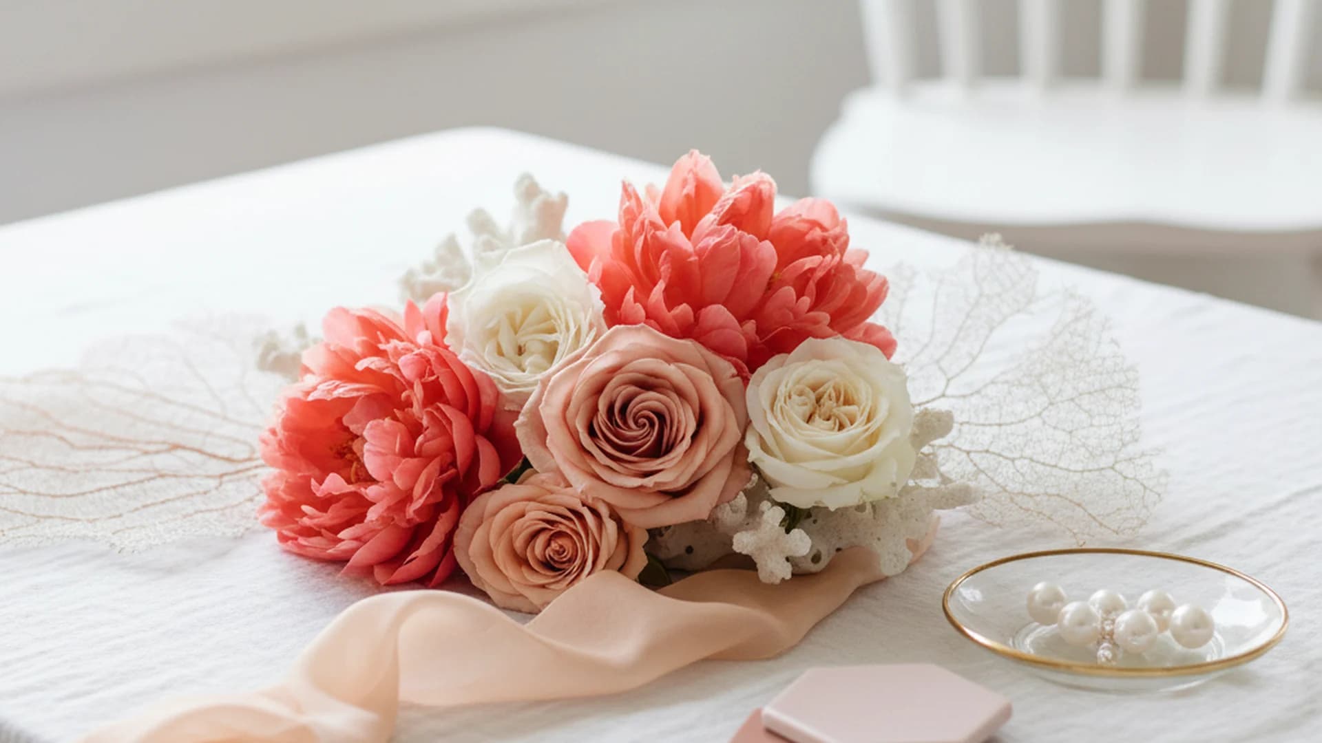
Sophisticated Pinks and Peaches
While pink remains a staple for many couples, the application has shifted. Instead of a singular bright pink, designers are using Blush Pink Wedding Colors as a base and layering them with Dusty Rose Wedding Colors for an ombre effect. This "monochromatic layering" is a hallmark of the 2026 "Fine Art" aesthetic, creating a look that mimics an Impressionist painting.
Designing with the "Rule of Three (Plus One)"
To prevent your pastel theme from looking like a child's birthday party, professional designers recommend the "Rule of Three (Plus One)." This involves selecting three primary pastel shades and adding one high-contrast "anchor" or metallic.
- Primary Shade 1 (The Base): A light neutral like ivory or Champagne Wedding Colors.
- Primary Shade 2 (The Mood): Your main pastel, such as sage or lavender.
- Primary Shade 3 (The Accent): A complementary pastel, like a soft peach.
- The Anchor (The "Plus One"): A deep, grounding color like charcoal, espresso, or a metallic like gold.
Tip
The Importance of Texture and Lighting
Because pastel colors have low saturation, they can easily look "flat" or washed out in professional photography—especially in bright sunlight. To combat this, you must introduce varied textures.
| Fabric Material | Visual Impact on Pastels | Best Application |
|---|---|---|
| Velvet | Adds shadows and deepens the color | Table runners, groom's loafers |
| Silk/Satin | Reflects light and adds a luminous glow | Bridesmaid dresses, ribbons |
| Linen | Provides an organic, matte finish | Tablecloths, napkins |
| Chiffon | Creates a soft, ethereal movement | Arch draping, dress overlays |
Lighting also plays a critical role. Pastels can take on a sickly yellow tint under standard indoor "warm" bulbs. Ensure your venue uses "soft white" or "warm amber" lighting to maintain the integrity of delicate pinks and peaches.
Heads up
From the OurVows workspace
Planning a wedding is a lot. We make it feel like less.
Checklist, budget, guest list, and a wedding website — together in one free workspace built for both of you.
Common Mistakes to Avoid
- The "Matchy-Matchy" Trap: Buying the exact same shade of mint for your shoes, ties, and cake. This creates a two-dimensional look. Instead, use a spectrum of mint, from the palest whisper-green to a mid-toned sage.
- Ignoring the Venue’s Base: If your venue has heavy burgundy carpets or dark mahogany walls, a "Mint and Peach" palette will clash violently. Always choose a palette that complements the existing flooring and architecture.
- Overlooking the Groom: Pastel palettes are not just "feminine." Modern combinations like Sage and Mocha or Dusty Blue and Charcoal are increasingly popular for gender-neutral or masculine-leaning designs.
- Forgetting the Season: While pastels are a spring staple, they can work year-round. For autumn, use "earthy" pastels like muted terracotta. For winter, opt for "icy" pastels like silver-gray and powder blue.
Real-World Examples of Modern Pastel Palettes
1. The "Juicy" Garden (2026 Trend)
This look uses a soft pastel base of pale yellow and cream but adds "juicy" pops of highly-saturated raspberry or tangerine in small doses, such as the cocktail napkins or the centers of the floral arrangements.
2. The Residential Neutral
Inspired by modern home interiors, this palette focuses on "non-color" pastels. It combines Mushroom, Taupe, and Pale Sage with black hardware (chairs or cutlery) for a high-fashion, editorial look.
3. The Tonal Lavender
Instead of mixing lavender with gold, this design uses five different shades of purple—from the lightest lilac to a deep plum anchor. It creates a rich, textured environment that feels incredibly expensive and curated.
Do this
Frequently asked questions
Are pastel colors only for spring weddings?
Can wedding guests wear bright colors to a pastel-themed wedding?
How do I make a pastel palette look modern?
What metallics pair best with pastels?
Conclusion
Mastering pastel wedding colors in 2025 and 2026 is about more than just picking a pretty shade; it is about creating a sensory experience through layering, texture, and thoughtful anchoring. By moving away from flat, one-dimensional palettes and embracing the "Quiet Luxury" of muted, nature-inspired tones, you can design a celebration that feels both timeless and trend-forward. Remember to consider your venue's existing colors and use a 12 Month Wedding Planning Checklist to stay on track as you bring your vision to life.
Do this
Ready when you are
Ready to Plan?
Organize your dream wedding color palette and stay on schedule with our professional tools.
Ready when you are
Plan your wedding without the chaos.
Free forever for couples just getting started. Two minutes to set up. No credit card.
Keep reading

The Ultimate Guide to Bright Wedding Colors for 2025 and 2026
Discover the most vibrant bright wedding colors for 2025-2026. From "juicy" reds to cobalt blue, learn how to design a high-energy, modern wedding palette.

Dusty Rose Wedding Colors: The Ultimate Guide to the New Neutral
Discover why Dusty Rose wedding colors are the perfect "new neutral" for 2025-2026. Explore seasonal pairings, floral choices, and expert design tips.
The Modern Guide to Coral Wedding Colors: 2025 Trends and Palettes
Explore the resurgence of coral wedding colors for 2025–2026. Learn how to style this versatile hue with expert tips on florals, fashion, and sophisticated color pairings.