The Ultimate Guide to Wedding Color Schemes: 2025-2026 Trends and Design Rules
Expert guide on choosing wedding color schemes. Learn the 60-30-10 rule, 2025-2026 trends like Mocha Mousse, and how to match your palette to your venue.
- Use the 60-30-10 rule to balance your primary, secondary, and accent colors.
- Finalize your venue before your colors, as most couples find the space dictates the palette.
- Anticipate a shift toward warm "Mocha Mousse" in 2025 and airy "Cloud Dancer" in 2026.
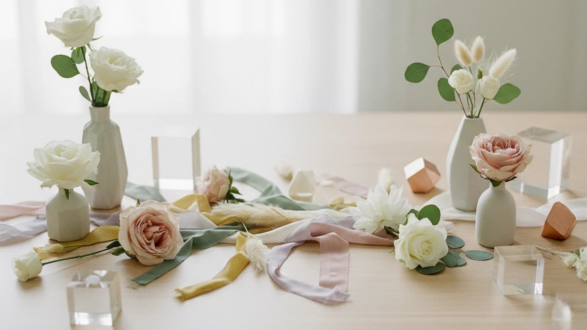
Choosing your wedding color schemes is the moment your celebration truly begins to take shape. It is the visual foundation upon which every other decision—from the invitation suite to the floral arrangements—is built. As a public speaking coach and vow ghostwriter, I often tell my clients that a wedding is a narrative. Just as the words in your vows convey your story, your color palette sets the emotional "vibe" of the room before a single word is spoken. Whether you are dreaming of a serene, monochromatic garden party or a high-drama, "juicy" colored ballroom affair, the right palette ensures your wedding feels cohesive, intentional, and authentically you.
Why the "Venue First" Rule Matters
In our experience, most couples secure their venue before finalizing their wedding color schemes. This isn't just a matter of logistics; it is a matter of design harmony. Every venue comes with its own "built-in" color palette—the mahogany of the ballroom panels, the slate gray of an industrial loft, or the vibrant green of a vineyard.
If you choose a palette of coral and gold but book a venue with deep burgundy carpets and heavy navy drapes, you will find yourself fighting the architecture. Instead of clashing, the most successful designs work with the space.
Assessing Your Space
- The Ballroom: Often features gold leaf, rich wood, or patterned carpets. These spaces usually call for classic anchors like ivory, champagne, or deep jewel tones.
- The Industrial Loft: Think exposed brick and gray concrete. These "blank canvases" are perfect for monochromatic bolds or "otherworldly neutrals."
- The Garden or Tent: With nature as your backdrop, sage green (the #1 color for 2025) and airy whites provide a seamless transition between the indoors and outdoors.
Tip
The Designer’s Secret: The 60-30-10 Rule
Many couples feel overwhelmed by how many colors to include. Should it be two? Should it be ten? Industry experts recommend a palette of 3 to 5 colors, balanced using the 60-30-10 rule borrowed from the world of interior design.
| Percentage | Element | Examples |
|---|---|---|
| 60% | Primary (Hero) Color | Linens, bridesmaid dresses, large-scale drapery |
| 30% | Secondary Color | Florals, invitation accents, table runners |
| 10% | Accent Color | Napkins, wax seals, metallic hardware, small details |
Following this ratio prevents one color from overwhelming the senses and ensures that your "accent" color actually pops rather than getting lost in the noise.
Note
Start with Feeling Over Color
Before you browse Pinterest for specific hues, ask yourself: How do I want the room to feel?
If you want an atmosphere that is energetic and fun, you should lean toward "Juicy Hues" like raspberry pink or papaya orange. If you want a day that feels serene and peaceful, look toward the 2026 "Cloud Dancer" trend—a billowy, airy white paired with slate blues or soft greens.
As someone who helps couples craft their vows, I see a direct correlation between the "feeling" of the decor and the tone of the ceremony. A couple choosing "Deep Emerald" and "Mocha" is often looking for a grounded, sophisticated, and intimate vibe, which usually translates into more formal, poetic vows.
Do this
Trending Palettes for 2025 and 2026
The wedding industry is shifting away from the "Millennial Pink" and muted eucalyptus phases of the last decade. We are entering an era of "Meaningful Minimalism" and "Immersive Bolds."
2025: The Year of Mocha Mousse
Pantone and industry forecasters are highlighting Mocha Mousse as a staple for 2025. This isn't a flat brown; it’s a decadent, warm neutral that feels grounding and sophisticated. Expect to see it paired with:
- Chartreuse: For an "Otherworldly Neutral" look.
- Gold and Ivory: For a modern take on the classic ballroom aesthetic.
- Sage Green: To lean into the "Venue First" greenery trend.
2026: Cloud Dancer and Airy Luxury
Looking further ahead to 2026, Cloud Dancer—a serene, billowy white—is set to take center stage. This signals a move toward "Airy Luxury," where the focus is on texture and light rather than heavy color. We expect to see this paired with "Juicy" accents like:
- Raspberry Pink
- Juicy Red
- Terracotta
Monochromatic Bolds
Rather than a traditional 3-color palette, more couples are opting for "monochromatic bolds." This involves taking one striking color—like Cobalt Blue—and using every shade of it, from the palest sky blue to the deepest midnight. This creates an immersive, editorial environment that looks incredible in photographs.
Tip
Understanding the Color Wheel
If you are struggling to find colors that "go" together, look to the color wheel for scientific guidance.
- Analogous Colors: These are colors next to each other on the wheel (e.g., Blue, Blue-Green, and Green). This creates a harmonious, easy-on-the-eyes look that is very popular for outdoor weddings.
- Complementary Colors: These are opposite each other (e.g., Yellow and Purple, or Orange and Blue). These pairings offer high-impact drama and are excellent for couples who want their wedding to feel vibrant and modern.
- Neutral Anchors: Always include a neutral. White, gold, and ivory/champagne are the workhorses of the wedding world. They provide "breathing room" for the eyes.
From the OurVows workspace
Planning a wedding is a lot. We make it feel like less.
Checklist, budget, guest list, and a wedding website — together in one free workspace built for both of you.
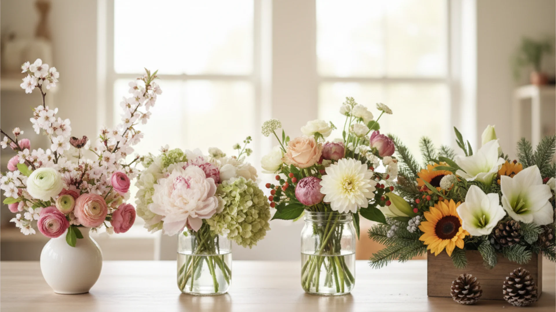
Real-World Examples of Wedding Color Schemes
To help you visualize these concepts, here are three real-world applications of current trends:
Example 1: The Modern Industrialist
- The Vibe: Sophisticated, Moody, Urban.
- The Palette: Slate Blue, Terracotta, and Copper.
- Application: Slate blue linens (60%), terracotta-colored florals and stationery (30%), and copper cutlery and chairs (10%).
- Why it works: The slate blue mimics the "urban" feel of a city venue, while the terracotta adds warmth so the space doesn't feel cold.
Example 2: The Ethereal Garden
- The Vibe: Romantic, Timeless, Soft.
- The Palette: Sage Green, Cloud Dancer White, and Mocha.
- Application: White draped tents and linens (60%), heavy sage greenery and white florals (30%), and mocha-colored wooden chairs or ribbons (10%).
- Why it works: It uses the most popular color of 2025 (Sage) while maintaining a classic look that won't feel dated in twenty years. For more on this look, see our Eucalyptus Wedding Greenery guide.
Example 3: The "Juicy" Summer Soiree
- The Vibe: Energetic, Bold, Playful.
- The Palette: Raspberry Pink, Papaya Orange, and Bright Gold.
- Application: Raspberry bridesmaid dresses and napkins (60%), orange and pink floral centerpieces (30%), and gold-rimmed glassware (10%).
- Why it works: It leans into the 2026 trend of "edible" colors, creating a high-energy environment perfect for a summer celebration.
Practical Tips for Working with Florists
Your wedding color schemes are only as good as the flowers available during your season. Some colors, like true blue or certain shades of gray, are incredibly rare in the floral world.
Heads up
Before you commit to a palette, it is wise to consult with a professional. We recommend checking out our list of Questions to Ask Wedding Florist to ensure your dream colors are actually achievable within your budget and season. For example, if you want deep reds and oranges, a Fall Wedding Flowers palette will be much more cost-effective than trying to source those colors in the spring.
Common Mistakes to Avoid
Even with the best intentions, it is easy to fall into a few common color traps.
1. The "Exact Match" Trap
Trying to make your flowers exactly match the bridesmaid dresses can result in a "flat" look. If the dresses are navy and the flowers are navy (which are rare anyway), they will disappear in photos. Aim for coordination through varying shades. If the dresses are navy, try light blue or white flowers with dark berries to create depth.
2. Ignoring Lighting
A color that looks beautiful in an outdoor morning garden may look muddy or even neon under yellow indoor ballroom lights. Always view your fabric swatches and flower samples under the actual lighting conditions of your venue if possible.
3. Over-reliance on Pinterest Trends
Trends move fast. What is "in" today might feel like a "dated" wedding in five years. To ensure your wedding feels timeless, try to incorporate at least one color that you already use in your home decor or that you frequently wear. This ensures the palette feels like an extension of your personality rather than a copied trend.
4. Forgetting the "Breathable" Neutrals
A palette of only bold colors (e.g., Purple, Orange, and Red) can be visually exhausting for guests. White, cream, or soft gray acts as a necessary "reset" for the eyes. Don't be afraid to let "Cloud Dancer" or ivory take up a large portion of your visual space.
Frequently asked questions
Do I need a set color palette?
How do I choose colors if my venue is already very colorful?
How many colors should be in a palette?
Are colored engagement rings a trend I should consider in my palette?
Conclusion
Selecting your wedding color schemes is one of the most creative parts of the planning process. By following the 60-30-10 rule, considering your venue first, and looking toward the sophisticated trends of 2025 and 2026, you can create a celebration that is both visually stunning and emotionally resonant. Remember, these colors are the backdrop to your "I do's"—make sure they tell the story you want to remember.
If you're still early in the process, consider looking at our Complete Guide to Wedding Flowers and Decor to see how these palettes come to life in floral design.
Do this
Ready when you are
Ready to Start?
Build your dream wedding palette and plan your perfect day today.
Ready when you are
Plan your wedding without the chaos.
Free forever for couples just getting started. Two minutes to set up. No credit card.
Keep reading
The Ultimate Guide to Wedding Flowers by Season: Trends for 2025-2026
Maximize your budget and style with our guide to wedding flowers by season. Discover 2025-2026 trends, seasonal availability, and expert cost-saving tips.

The Ultimate Wedding Flower Budget Guide for 2025–2026
Navigate your 2025-2026 wedding flower costs with our expert budget guide. Learn current pricing, allocation tips, and ways to maximize your floral impact.

The Ultimate Guide to Eucalyptus Wedding Greenery: Trends for 2025 and Beyond
Explore why eucalyptus wedding greenery is the gold standard for modern ceremonies. Learn about varieties, 2025-2026 trends, and essential care tips.