The Ultimate Guide to Terracotta Wedding Colors: 2025-2026 Trends
Discover why terracotta wedding colors are the top choice for 2025 and 2026. Learn how to style this earthy, sophisticated hue for every season and venue.

- Terracotta is a "chameleon" color suitable for all seasons, not just autumn.
- Success lies in layering textures like satin, velvet, and authentic ceramics.
- Avoid "matchy-matchy" palettes; instead, use a spectrum from peach-clay to rust.
Terracotta—meaning "baked earth" in Italian—has undergone a stunning transformation in recent years. Once pigeonholed as a strictly rustic or bohemian staple, terracotta wedding colors have evolved into a "main character" palette for 2025 and 2026. This rich, clay-inspired hue offers a unique blend of warmth, stability, and sophistication that works across every season and setting, from minimalist city lofts to luxury garden estates.
As a relationship counselor, I often see couples choose colors that reflect their shared values. Terracotta is a complex mix of orange, red, and brown tones, symbolically associated with grounding and authenticity. Choosing this palette isn't just a design choice; it’s a visual representation of a foundation built to last.
Why Terracotta is the "Chameleon" of Wedding Colors
Industry experts often label terracotta as a "chameleon" because of its incredible versatility. Unlike brighter oranges that can feel overwhelming or muted browns that can feel flat, terracotta sits in a "sweet spot" of saturation. It adapts to its surroundings based on the accent colors you choose to pair with it.
For instance, when paired with citrus tones, it evokes a sun-drenched Mediterranean afternoon. When set against navy or forest green, it becomes moody, dramatic, and deeply elegant. This adaptability is why we are seeing it move beyond the desert-boho aesthetic into high-end, contemporary celebrations.
Note
2025 and 2026 Terracotta Color Palettes
As we look toward the 2025 and 2026 wedding seasons, the way couples use terracotta is shifting. We are moving away from the "all-orange" look and toward more nuanced, sophisticated combinations.
The Grounded Garden (2025 Trend)
This palette is the leading trend for 2025. It moves away from the "dusty" look of previous years toward a fresher, lusher aesthetic.
- Primary Colors: Terracotta, Sage Green, and Cream.
- Vibe: Organic, fresh, and timeless.
- Best For: Outdoor garden weddings or vineyard celebrations.
- Related Reading: Check out our guide on Sage Green Wedding Colors to see how to balance these two earthy tones.
The Citrus Burst (Summer 2026 Trend)
Expect to see this high-energy palette dominate Summer 2026. It’s a joyful departure from traditional wedding neutrals.
- Primary Colors: Terracotta, Lemon Yellow, and Papaya Orange.
- Vibe: Mediterranean, vibrant, and festive.
- Best For: Destination weddings or coastal summer receptions.
The Modern Monochrome
For the couple who loves minimalist luxury, a monochromatic terracotta palette uses various shades of the same family.
- Primary Colors: Deep Rust, Soft Peach-Clay, and Bronze.
- Vibe: High-fashion, architectural, and warm.
- Best For: Industrial loft venues or modern art galleries.
| Season | Best Accents | Suggested Texture |
|---|---|---|
| Spring | Blush Pink & Butter Yellow | Gauze & Linen |
| Summer | Teal & Lemon | Silk & Ceramic |
| Fall | Olive & Copper | Velvet & Wood |
| Winter | Navy Blue & Gold | Satin & Heavy Crepe |
Elevating the Aesthetic: Fabrics and Textures
To make terracotta look expensive and curated—rather than "crafty"—you must focus on the materials used. Because terracotta is an earthy color, using cheap plastic or low-quality polyester can make the decor look dated.
Layering Textures
To prevent the color from feeling flat in photos, mix your materials. Use matte terracotta pots as centerpieces, but pair them with silk table runners and velvet ribbons on the bouquets. The contrast between the "rough" clay and the "smooth" fabric creates a visual depth that looks incredible in professional photography.
Mixed Metal Accents
While gold was the traditional choice for years, 2026 trends see bronze and copper being used to create a monochromatic metallic effect. These metals mimic the natural earthiness of clay and add a subtle shimmer without the high-contrast "flash" of silver.
Tip
From the OurVows workspace
Planning a wedding is a lot. We make it feel like less.
Checklist, budget, guest list, and a wedding website — together in one free workspace built for both of you.
Real-World Examples of Terracotta Styling
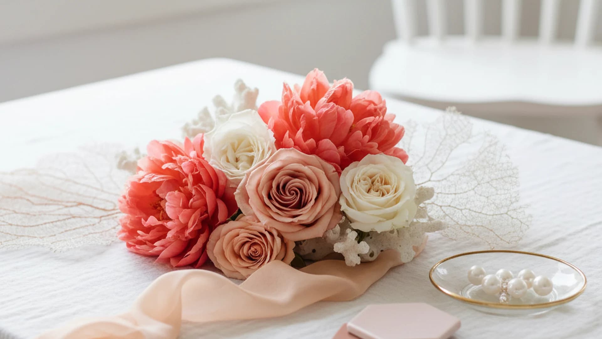
Example 1: The "Fine Art" Floral Arrangement
Instead of the 2020 trend of using only dried pampas grass, 2025 brides are mixing terracotta-tinted fresh ranunculus with bleached Italian Ruscus. This creates a "fine art" look that feels sophisticated and intentional rather than purely rustic.
Example 2: The Groom’s Contemporary Look
Terracotta isn't just for bridesmaids. A popular 2025 trend is a terracotta-colored linen suit for a summer wedding, or a deep rust velvet blazer for a winter celebration. If a full suit feels too bold, consider terracotta-toned leather shoes or a floral tie in clay hues.
Example 3: Authentic Ceramic Centerpieces
One of the most effective ways to ground this palette is to use actual clay pots. Instead of standard glass vases, use varying heights of unglazed terracotta vessels. Not only is this eco-friendly, but the vessels can often be gifted to guests as sustainable favors at the end of the night.
Do this
Common Mistakes to Avoid
When working with such a saturated and "heavy" color, there are a few pitfalls to keep in mind:
- The "Matchy-Matchy" Trap: Many couples try to find the exact same shade of terracotta for dresses, napkins, and flowers. This actually "flattens" the visual interest. It is much better to use a spectrum of tones—some lighter, some darker—to create dimension.
- Pairing with "Icy" Tones: Avoid silver or icy grays. These cool, bright metallics clash with the warmth of the clay. If you want a cool contrast, look to Navy Blue Wedding Colors instead.
- Overuse in Small Spaces: Because terracotta is a "weighty" color, using too much of it in a small, dark venue can make the room feel cramped. In smaller spaces, use terracotta as an accent against white or cream walls.
- Confusing "Rust" with "Terracotta": Rust is much redder and darker. True terracotta has a softer, more "baked" orange-pink undertone. Mixing the two without intention can create a disjointed look.
Heads up
Frequently asked questions
What colors go best with terracotta?
Is terracotta only for fall weddings?
Does terracotta suit all skin tones?
How do I make terracotta decor look high-end?
Conclusion
Terracotta wedding colors offer a perfect balance of trend-forward style and timeless stability. Whether you are planning a "Grounded Garden" wedding in 2025 or a "Citrus Burst" celebration in 2026, this palette provides the flexibility to create a truly unique atmosphere. By layering textures, embracing a spectrum of shades, and avoiding common pitfalls, you can create a wedding day that feels both modern and deeply authentic.
As you continue your planning journey, remember that your color palette is the backdrop to your celebration of partnership. Just like the "baked earth" the color is named for, may your marriage be strong, warm, and beautiful.
Do this
Ready when you are
Start Your Planning
Organize your dream wedding with our professional tools today.
Ready when you are
Plan your wedding without the chaos.
Free forever for couples just getting started. Two minutes to set up. No credit card.
Keep reading

The Ultimate Guide to Bright Wedding Colors for 2025 and 2026
Discover the most vibrant bright wedding colors for 2025-2026. From "juicy" reds to cobalt blue, learn how to design a high-energy, modern wedding palette.

Dusty Rose Wedding Colors: The Ultimate Guide to the New Neutral
Discover why Dusty Rose wedding colors are the perfect "new neutral" for 2025-2026. Explore seasonal pairings, floral choices, and expert design tips.
The Modern Guide to Coral Wedding Colors: 2025 Trends and Palettes
Explore the resurgence of coral wedding colors for 2025–2026. Learn how to style this versatile hue with expert tips on florals, fashion, and sophisticated color pairings.